Time-lapse Video Shows Smoke Plumes from Wildfires
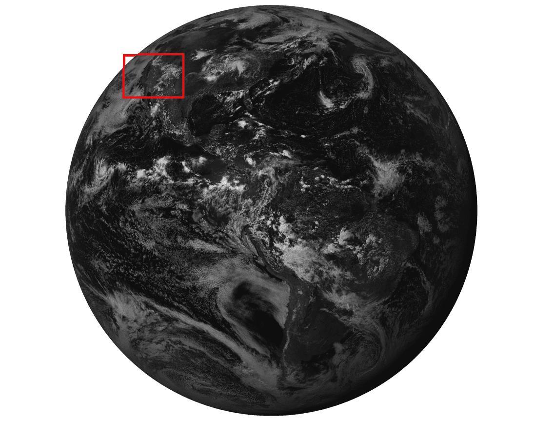
Using satellite imagery, the UC Davis Library collaborated with the UC Davis Center for Spatial Technologies and Remote Sensing (CSTARS) to create the four-day time-lapse video below. The video, also featured on the UC Davis Science & Climate blog, shows the extent of the smoke from the Camp Fire in Butte County and the Woolsey Fire in Ventura County from November 9-13, 2018.
Quinn Hart, digital applications manager at the UC Davis Library, created the video using satellite images downloaded directly from NOAA’s Geostationary Operational Environmental Satellite (GOES) by UC Davis researchers at CSTARS. Images were captured every seven minutes and integrated into a single time-lapse.
Differentiating Smoke from Clouds
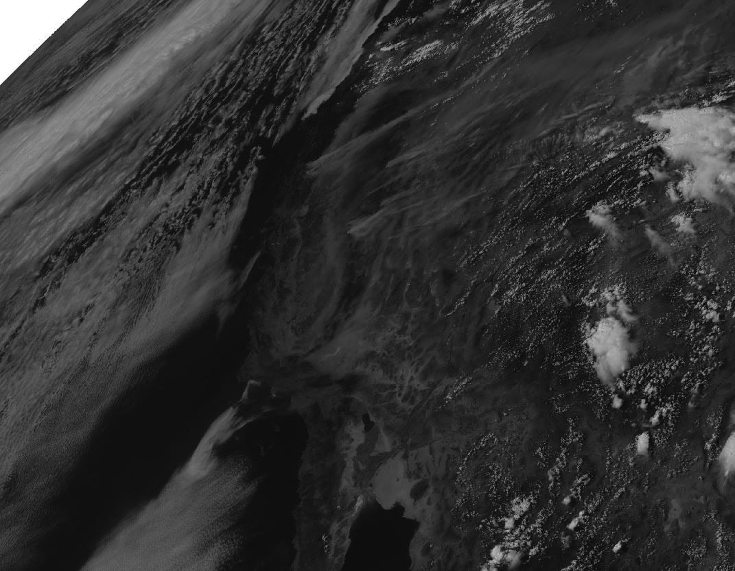
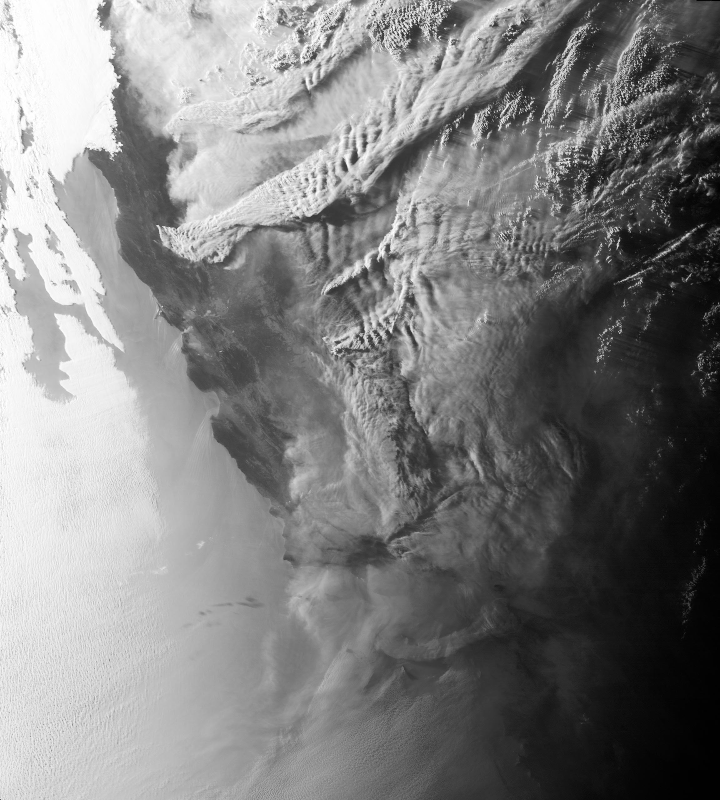
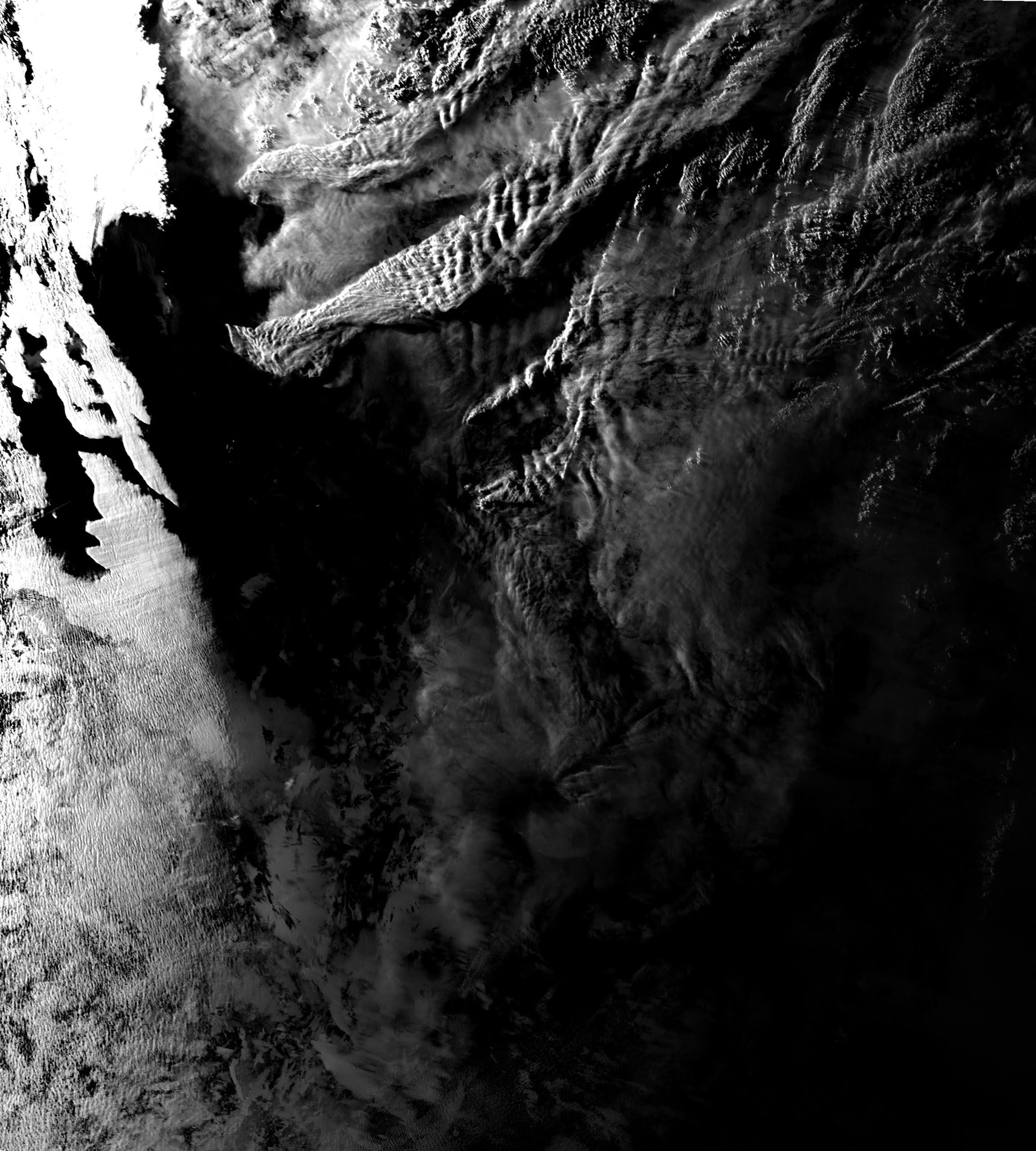
In the video, smoke can be seen moving rapidly from two locations, the Camp Fire in northern California and the Woolsey Fire in southern California. By combining different shortwave infrared images, the video allows viewers to differentiate between clouds, smoke and dust.
Two Fires Over Five Days
- Friday: Two large smoke plumes indicate the location of each fire.
- Saturday: Cloud cover starts to come in, making it harder to differentiate between clouds and smoke. However, the clouds are traveling in a different direction from the smoke because surface winds (which carry the smoke) and the jetstream (which determines where weather comes from) move in different directions.
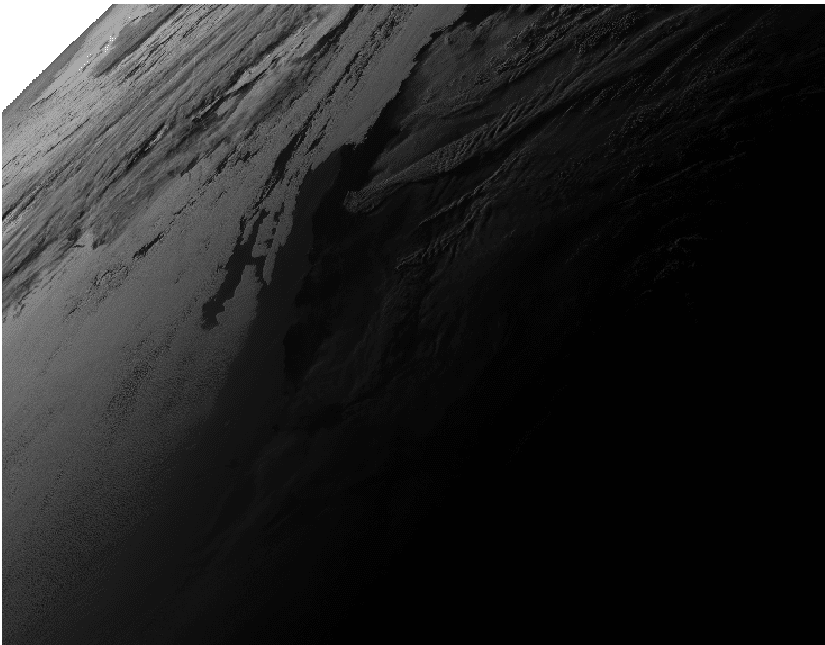
- Sunday: Smoke from the Ventura fire has dissipated, but wind speed picked up in Butte County. The smoke is blowing out to sea, which is a bit unusual since wind patterns typically blow in the opposite direction (west to east).
- Monday: Cloud cover makes it difficult to differentiate between smoke and clouds.
- Tuesday: Significant cloud cover moves in from the west.
How Satellite Imagery Works
The GOES Weather Satellites operate in a geostationary orbit. Synchronized with the rotation of the earth, the satellite stays fixed over the same point on the planet’s surface, allowing us to view and monitor the same area over time.
Satellite Imagery Improvements
Recently, NOAA launched their next generation of weather satellites. The new satellite has four times the spatial resolution and a higher temporal frequency then the previous satellite. UC Davis’ Institute of the Environment and CSTARS maintain a direct connection to NOAA’s GOES Weather Satellites through receiver dishes on campus at Academic Surge and Kemper Hall. Though satellite imagery received at UC Davis is typically used to help predict water demand for California’s farmers, this video shows how the technology can be used for other purposes as well.
The Library’s Role
One of the unique challenges in a situation like these wildfires is how much data there is, and how fast that data comes in.
—Quinn Hart, Digital Applications Manager for the UC Davis Library
The central work of a library is to help people access and make sense of information in all forms. Today, that includes developing digital tools that can help researchers analyze and understand large, complex data sets.
Whether it’s text-mining newspaper archives, creating a wine price database from vintage catalogs, or creating visualizations using satellite images or GIS data, the library can partner with researchers to organize data in ways that allow new patterns and insights to emerge.
“The library is going to have a big role in making data discoverable,” Hart said. “This information is important for the state and public since it affects everyone in the area. In the future, we want to come up with a system to provide data for both groups to show how much wildfires do affect people.”
Hart noted that there is tremendous potential to integrate satellite imagery with environmental decision making. Satellite imagery can be used to monitor a wide array of environmental issues such as energy demand, monitoring flood events, tracking fires at night and more.
If You Want to See More…
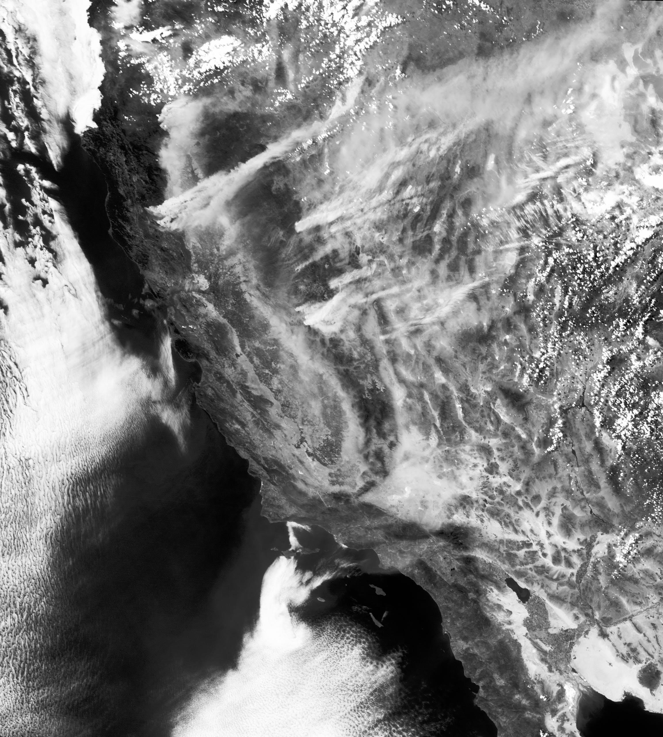
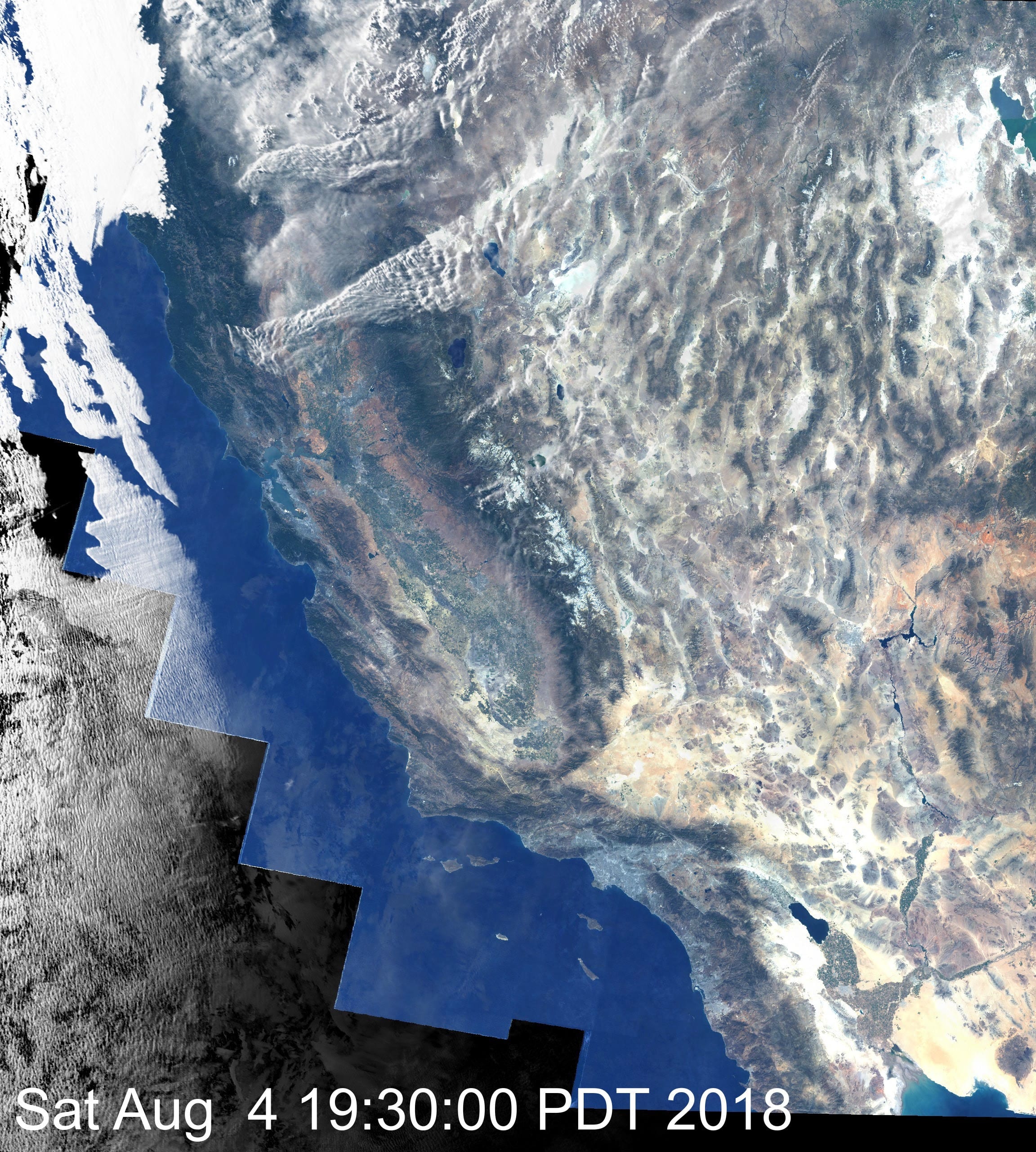
Hart developed similar videos showing the impact of California wildfires during a nine-day period in August 2018, including the Mendocino Complex Fire. These videos show images captured at 15-minute intervals, and both have been enhanced to highlight the extent of the smoke plumes. The second of the two shows clouds and smoke superimposed on a true-color image of California.
How We Built This
Ready to look under the hood? Using the August 2018 color video as an example, here is a step-by-step overview of how we created these videos.